Hi in this Android compose tutorial we learn android compose layouts with examples. How to make layouts in android using the jetpack. So here we make a layout showing a card with an image and name. The android UI elements are hierarchic and elements are used in another element.
Add multiple texts in Android compose Layouts
So let’s build our first composable function and preview. And to discover more about Android Compose Layouts capabilities and make a simple messaging screen that shows a list of messages that can be expandable with animations.
So Let’s make a message compose that is rich by displaying the name of the person and Description. We need to change our composable variable to accept an Message object instead of a and add another Text composable inside of MessageCard. And also make sure you update the preview function as well as in your code.
class MainActivity : ComponentActivity() {
override fun onCreate(savedInstanceState: Bundle?) {
super.onCreate(savedInstanceState)
        setContent {
MessageCard(Message("Android Tutorial", "Jetpack Compose Example"))
}
}
}

data class Message(val name: String, val msg: String)

@Composable
fun MessageCard(msg: Message) {
Text(text = msg.name)
Text(text = msg.msg)
}

@Preview
@Composable
fun PreviewMessageCard() {
MessageCard(
        msg = Message("Codeplayon", " Jetpack Compose, it's great!")
)
}
How to make a column Layout in Android compose Layouts
Using a Column
The Column function lets use an element vertically. Add Column to the MessageCard() function. You can make a new row to arrange items of the list horizontally.
Add an image element
Let’s upgrade the message card by adding the user profile. And use the resource manager for importing the image from the photo library. And add a Row compose to have a good structure and Image composable inside it:
@Composable
fun MessageCard(msg: Message) {
    Row {
        Image(
            painter = painterResource(R.drawable.profile_picture),
            contentDescription = "profile picture",
        )

       Column {
            Text(text = msg.author)
            Text(text = msg.body)
        }

    }

}
Configure your layout ( Android compose Layouts )
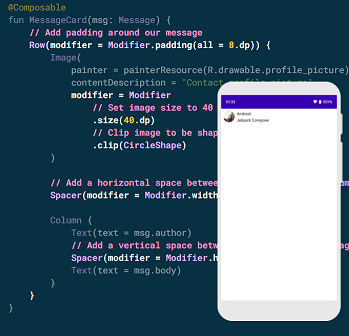
Also, make sure your message layout has the right structure but its elements aren’t well spaced and the image is too big. Also, you can decorate and configure the compose. They allow changing the compose size and the layout appearance. Also, you can add high-level interactions, such as making an element clickable. You can chain them to create richer compostables. Let’s use some of them to improve the layout: You can find below the full source code of the android compose layout.
Full Source code Android compose Layouts:-
package com.codeplayon.simpleappusingwithjetpackcompose

import android.os.Bundle
import androidx.activity.ComponentActivity
import androidx.activity.compose.setContent
import androidx.compose.foundation.Image
import androidx.compose.foundation.layout.*
import androidx.compose.foundation.shape.CircleShape
import androidx.compose.material.MaterialTheme
import androidx.compose.material.Surface
import androidx.compose.material.Text
import androidx.compose.runtime.Composable
import androidx.compose.ui.Modifier
import androidx.compose.ui.draw.clip
import androidx.compose.ui.res.painterResource
import androidx.compose.ui.tooling.preview.Preview
import androidx.compose.ui.unit.dp
import com.codeplayon.simpleappusingwithjetpackcompose.ui.theme.SimpleAppUsingWithJetpackComposeTheme

class MainActivity : ComponentActivity() {
    override fun onCreate(savedInstanceState: Bundle?) {
        super.onCreate(savedInstanceState)
        setContent {
            SimpleAppUsingWithJetpackComposeTheme {

                Surface(color = MaterialTheme.colors.background) {
                    MessageCard(Message("Codeplayon", "Jetpack Compose Tutorial"))
                }
            }
        }
    }
}

data class Message(val name: String, val msg: String)

@Composable
fun Greeting(name: String) {
    Text(text = "Hello $name!")
}

@Composable
fun MessageCard(msg: Message) {
    // Add padding around our message
    Row(modifier = Modifier.padding(all = 8.dp)) {
        Image(
            painter = painterResource(R.drawable.ic_launcher_background),
            contentDescription = "Contact profile picture",
            modifier = Modifier
                // Set image size 40 dp
                .size(40.dp)
                // Clip used shaped as a circle
                .clip(CircleShape)
        )

        // Add a horizontal space
        Spacer(modifier = Modifier.width(8.dp))

        Column {
            Text(text = msg.author)
            // Add a vertical space
            Spacer(modifier = Modifier.height(4.dp))
            Text(text = msg.body)
        }
    }

}

@Preview(showBackground = true)
@Composable
fun DefaultPreview() {
    SimpleAppUsingWithJetpackComposeTheme {
//        Greeting("Android")
        MessageCard(
            msg = Message("Codeplyon", "Jetpack Compose tutorial")
        )
    }
}