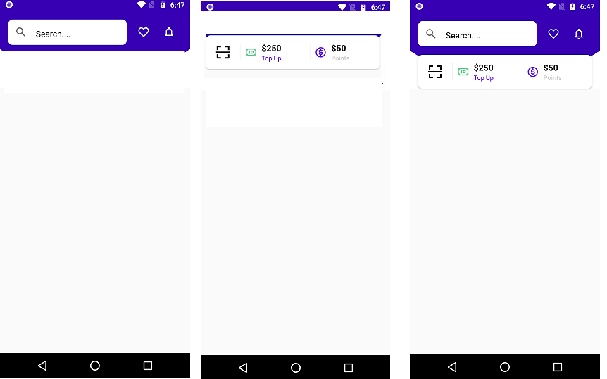
Hi Developer in this jetpack compose example I make a UI Jetpack compose topAppBar and Header. Like an E-commerce App, you can see at the top of the screen a Search bar, Favorite product, Notification, etc. And at the below od table bar you can see some button. These are all UI I create using the jetpack compose tool kit. Also, I add the jetpack compose appbaricon in this example and the jetpack compose card View.
Jetpack compose is a great new declarative UI tool kit for Android that allows UI creation using Kotlin without a line of code in XML. Jetpack compose is a replacement for the cumbersome XML layouts. This article will provide a straightforward demonstration of Jetpack Compose inside the context of a project.
You can follow this guide in case you are running already an XML layout-based Android app and wish to integrate Compose UI elements in it, or want to start your own app and wish to create the UI using Compose from the beginning.
To experience the best possible experience in developing in Jetpack Compose to get the best experience, you must install Android Studio Arctic Fox, which allows you to access your built-in view of the UI that you design. Additionally, it comes with the ability to create an entirely fresh Compose project.
Jetpack compose topAppBar menu
Let’s Start to make it start your android studio and create a new Project choose with jetpack activity. And Wait for the building project successfully after that add dependency in your Gradle module and syn project.
Add Dependencies
dependencies {

    implementation 'androidx.core:core-ktx:1.7.0'
    implementation "androidx.compose.ui:ui:$compose_version"
    implementation "androidx.compose.material:material:$compose_version"
    implementation "androidx.compose.ui:ui-tooling-preview:$compose_version"
    implementation 'androidx.appcompat:appcompat:1.3.0'
    implementation 'com.google.android.material:material:1.3.0'
    implementation 'androidx.lifecycle:lifecycle-runtime-ktx:2.3.1'
    implementation 'androidx.activity:activity-compose:1.3.1'
    testImplementation 'junit:junit:4.13.2'
    androidTestImplementation 'androidx.test.ext:junit:1.1.3'
    androidTestImplementation 'androidx.test.espresso:espresso-core:3.4.0'
    androidTestImplementation "androidx.compose.ui:ui-test-junit4:$compose_version"
    debugImplementation "androidx.compose.ui:ui-tooling:$compose_version"


}
After adding Dependencies syn your project to successfully build. Now the next step is to open our Main Activity Kotlin class and implement it.
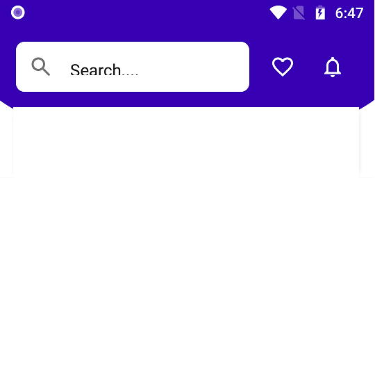
jetpack compose appbaricon
@Composable
fun AppBar() {
    Row(
        Modifier
            .padding(16.dp)
            .height(48.dp),
        verticalAlignment = Alignment.CenterVertically,
        horizontalArrangement = Arrangement.SpaceAround
    ) {
        var text by remember { mutableStateOf("Search....") }
        TextField(
            value = text,
            onValueChange = {text = it},
//            label = { Text(text = "Search....", fontSize = 12.sp) },
            singleLine = true,
            leadingIcon = { Icon(imageVector = Icons.Rounded.Search, contentDescription = "Search") },
            colors = TextFieldDefaults.textFieldColors(
                backgroundColor = Color.White,
                focusedIndicatorColor = Color.Transparent,
                unfocusedIndicatorColor = Color.Transparent
            ),
            shape = RoundedCornerShape(8.dp),
            modifier = Modifier
                .weight(1f)
                .fillMaxHeight()
        )
        Spacer(modifier = Modifier.width(8.dp))
        IconButton(onClick = { }) {
            Icon(imageVector = Icons.Outlined.FavoriteBorder, contentDescription = "",
tint = Color.White)
        }
        IconButton(onClick = {}) {
            Icon(imageVector = Icons.Outlined.Notifications, contentDescription = "",
 tint = Color.White)
        }

    }
}
Jetpack compose Iconbutton.
@Composable
fun QrButton() {
    IconButton(
        onClick = {},
        modifier = Modifier
            .fillMaxHeight()
            .aspectRatio(1f)
    ) {
        Icon(
            painter = painterResource(id = R.drawable.ic_scan),
            contentDescription = "",
            modifier = Modifier
                .fillMaxSize()
                .padding(16.dp)
        )
    }
}
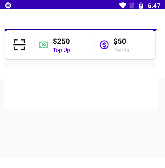
Jetpack compose CardView.
@Composable
fun Header() {
    Card(
        Modifier
            .height(64.dp)
            .padding(horizontal = 16.dp),
        elevation = 4.dp,
        shape = RoundedCornerShape(8.dp)
    ) {
        Row(
            Modifier.fillMaxSize(),
            verticalAlignment = Alignment.CenterVertically
        ) {
            QrButton()

            VerticalDivider()
            Row(Modifier
                .fillMaxHeight()
                .weight(1f)
                .clickable { }
                .padding(horizontal = 8.dp),
                verticalAlignment = Alignment.CenterVertically
            ) {
                Icon(painter = painterResource(id = R.drawable.ic_money), contentDescription = "",
tint = Color(0xFF6FCF97))
                Column(Modifier.padding(8.dp)) {
                    Text(text = "$250", fontWeight = FontWeight.Bold, fontSize = 16.sp)
                    Text(text = "Top Up", color = MaterialTheme.colors.primary, fontSize = 12.sp)
                }
            }

            VerticalDivider()
            Row(Modifier
                .fillMaxHeight()
                .weight(1f)
                .clickable { }
                .padding(horizontal = 8.dp),
                verticalAlignment = Alignment.CenterVertically
            ) {
                Icon(painter = painterResource(id = R.drawable.ic_coin), contentDescription = "",
tint = MaterialTheme.colors.primary)
                Column(Modifier.padding(8.dp)) {
                    Text(text = "$50", fontWeight = FontWeight.Bold, fontSize = 16.sp)
                    Text(text = "Points", color = Color.LightGray, fontSize = 12.sp)
                }
            }
        }
    }
}
Jetpack compose topAppBar menu Full Source code.
package com.codeplayon.jetpackdashboard

import android.os.Bundle
import androidx.activity.ComponentActivity
import androidx.activity.compose.setContent
import androidx.compose.foundation.Image
import androidx.compose.foundation.clickable
import androidx.compose.foundation.layout.*
import androidx.compose.foundation.rememberScrollState
import androidx.compose.foundation.shape.RoundedCornerShape
import androidx.compose.foundation.verticalScroll
import androidx.compose.material.*
import androidx.compose.material.icons.Icons
import androidx.compose.material.icons.outlined.FavoriteBorder
import androidx.compose.material.icons.outlined.Notifications
import androidx.compose.material.icons.rounded.Search
import androidx.compose.runtime.*
import androidx.compose.ui.Alignment
import androidx.compose.ui.Modifier
import androidx.compose.ui.graphics.Color
import androidx.compose.ui.layout.ContentScale
import androidx.compose.ui.res.painterResource
import androidx.compose.ui.text.font.FontWeight
import androidx.compose.ui.tooling.preview.Preview
import androidx.compose.ui.unit.dp
import androidx.compose.ui.unit.sp
import com.codeplayon.jetpackdashboard.ui.theme.JetpackDashboardTheme

class MainActivity : ComponentActivity() {
    override fun onCreate(savedInstanceState: Bundle?) {
        super.onCreate(savedInstanceState)
        setContent {
            MainTheme {
                HomeScreen()
            }
        }
    }
}

@Composable
fun MainTheme(content: @Composable () -> Unit) {
    JetpackDashboardTheme {
        Surface(color = MaterialTheme.colors.background) {
            content()
        }
    }
}


@Preview(showBackground = true)
@Composable
fun DefaultPreview() {
    MainTheme {
        HomeScreen()
    }
}

@Composable
fun HomeScreen() {
    Box(Modifier.verticalScroll(rememberScrollState())) {
        Image(
            modifier = Modifier
                .fillMaxWidth()
                .offset(0.dp, (-30).dp),
            painter = painterResource(id = R.drawable.bg_main),
            contentDescription = "Header Background",
            contentScale = ContentScale.FillWidth
        )
        Column {
            AppBar()
            Content()

        }
    }
}


@Composable
fun AppBar() {
    Row(
        Modifier
            .padding(16.dp)
            .height(48.dp),
        verticalAlignment = Alignment.CenterVertically,
        horizontalArrangement = Arrangement.SpaceAround
    ) {
        var text by remember { mutableStateOf("Search....") }
        TextField(
            value = text,
            onValueChange = {text = it},
//            label = { Text(text = "Search....", fontSize = 12.sp) },
            singleLine = true,
            leadingIcon = { Icon(imageVector = Icons.Rounded.Search, contentDescription = "Search") },
            colors = TextFieldDefaults.textFieldColors(
                backgroundColor = Color.White,
                focusedIndicatorColor = Color.Transparent,
                unfocusedIndicatorColor = Color.Transparent
            ),
            shape = RoundedCornerShape(8.dp),
            modifier = Modifier
                .weight(1f)
                .fillMaxHeight()
        )
        Spacer(modifier = Modifier.width(8.dp))
        IconButton(onClick = { }) {
            Icon(imageVector = Icons.Outlined.FavoriteBorder, contentDescription = "",
 tint = Color.White)
        }
        IconButton(onClick = {}) {
            Icon(imageVector = Icons.Outlined.Notifications, contentDescription = "",
 tint = Color.White)
        }

    }
}

@Composable
fun Content() {
    Column() {
        Header()
    }
}

@Composable
fun Header() {
    Card(
        Modifier
            .height(64.dp)
            .padding(horizontal = 16.dp),
        elevation = 4.dp,
        shape = RoundedCornerShape(8.dp)
    ) {
        Row(
            Modifier.fillMaxSize(),
            verticalAlignment = Alignment.CenterVertically
        ) {
            QrButton()

            VerticalDivider()
            Row(Modifier
                .fillMaxHeight()
                .weight(1f)
                .clickable { }
                .padding(horizontal = 8.dp),
                verticalAlignment = Alignment.CenterVertically
            ) {
                Icon(painter = painterResource(id = R.drawable.ic_money), contentDescription = "",
tint = Color(0xFF6FCF97))
                Column(Modifier.padding(8.dp)) {
                    Text(text = "$250", fontWeight = FontWeight.Bold, fontSize = 16.sp)
                    Text(text = "Top Up", color = MaterialTheme.colors.primary, fontSize = 12.sp)
                }
            }

            VerticalDivider()
            Row(Modifier
                .fillMaxHeight()
                .weight(1f)
                .clickable { }
                .padding(horizontal = 8.dp),
                verticalAlignment = Alignment.CenterVertically
            ) {
                Icon(painter = painterResource(id = R.drawable.ic_coin), contentDescription = "",
tint = MaterialTheme.colors.primary)
                Column(Modifier.padding(8.dp)) {
                    Text(text = "$50", fontWeight = FontWeight.Bold, fontSize = 16.sp)
                    Text(text = "Points", color = Color.LightGray, fontSize = 12.sp)
                }
            }
        }
    }
}

@Composable
fun QrButton() {
    IconButton(
        onClick = {},
        modifier = Modifier
            .fillMaxHeight()
            .aspectRatio(1f)
    ) {
        Icon(
            painter = painterResource(id = R.drawable.ic_scan),
            contentDescription = "",
            modifier = Modifier
                .fillMaxSize()
                .padding(16.dp)
        )
    }
}

@Composable
fun VerticalDivider() {
    Divider(
        color = Color(0xFFF1F1F1),
        modifier = Modifier
            .width(1.dp)
            .height(32.dp)
    )
}
After completing the steps you can run your App and see the Output. Jetpack compose dashboard App Part 1
Read More Tutorial