Hi, Android developer in this codeplayon article I make a Jetpack compose LazyRow horizontal list. Like we a horizontal list with card view and showing a list of item hare, For example, you can see any e-commerce App the showing a banner offer list in the dashboard simile UI I make with jetpack compose.
Jetpack compose is the latest UI kit for android the Mak UI without using XML code. So it a very interesting in android development and the future of android with Kotlin. So let’s start with me learning jetpack composition step by step and easy way.
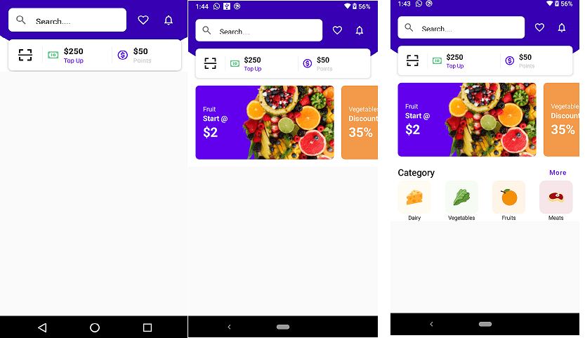
This is the second part of the Dashboard App. This par with included a Promotion Banner, Category, And Best product. On the Home Screen UI. So let’s start to make it.
Start your android studio and make a new Project and you have already a project open it Also you can open your Dashboard part 1 project and for the next step of UI follow the step.
Also Read:- Jetpack compose topappbar menu and Header | Dashboard App Part 1
Jetpack compose LazyRow horizontal list | Dashboard App Part 2
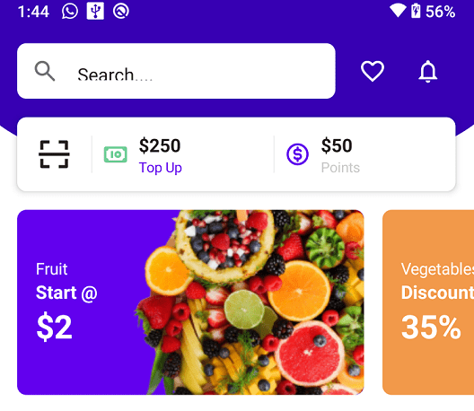
Step 1: One Create LazyRow horizontal list for Promotion Banner.
here I create a list with the banner list for showing the promotion banner on the home screen. So let,s used the below code for these.
@Composable
fun Promotions() {
    LazyRow(
        Modifier.height(160.dp),
        contentPadding = PaddingValues(horizontal = 16.dp),
        horizontalArrangement = Arrangement.spacedBy(16.dp)
    ) {
        item {
            PromotionItem(
                imagePainter = painterResource(id = R.drawable.promotion),
                title = "Fruit",
                subtitle = "Start @",
                header = "$2",
                backgroundColor = MaterialTheme.colors.primary
            )
        }
        item {
            PromotionItem(
                imagePainter = painterResource(id = R.drawable.promotion),
                title = "Vegetables",
                subtitle = "Discount",
                header = "35%",
                backgroundColor = Color(0xffF2994A)
            )
        }
    }
}

@Composable
fun PromotionItem(
    title: String = "",
    subtitle: String = "",
    header: String = "",
    backgroundColor: Color = Color.Transparent,
    imagePainter: Painter
) {
    Card(
        Modifier.width(300.dp),
        shape = RoundedCornerShape(8.dp),
        backgroundColor = backgroundColor,
        elevation = 0.dp
    ) {
        Row {
            Column(
                Modifier
                    .padding(horizontal = 16.dp)
                    .fillMaxHeight(),
                verticalArrangement = Arrangement.Center
            ) {
                Text(text = title, fontSize = 14.sp, color = Color.White)
                Text(text = subtitle, fontSize = 16.sp, color = Color.White, fontWeight = FontWeight.Bold)
                Text(text = header, fontSize = 28.sp, color = Color.White, fontWeight = FontWeight.Bold)
            }
            Image(
                painter = imagePainter, contentDescription = "",
                modifier = Modifier
                    .fillMaxHeight()
                    .weight(1f),
                alignment = Alignment.CenterEnd,
                contentScale = ContentScale.Crop
            )
        }
    }
}
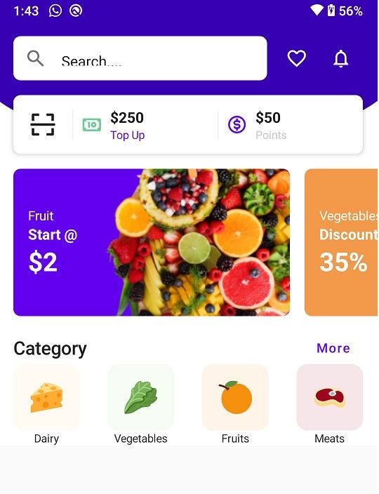
Step: 2 Create a horizontal list product category list;
Now the next step is to create a category list below of promotion banner list. Show a horizontal list included with category name and image.
@Composable
fun CategorySection() {
    Column(Modifier.padding(horizontal = 16.dp)) {
        Row(
            Modifier.fillMaxWidth(),
            verticalAlignment = Alignment.CenterVertically,
            horizontalArrangement = Arrangement.SpaceBetween
        ) {
            Text(text = "Category", style = MaterialTheme.typography.h6)
            TextButton(onClick = {}) {
                Text(text = "More", color = MaterialTheme.colors.primary)
            }
        }

        Row(
            Modifier.fillMaxWidth(),
            horizontalArrangement = Arrangement.SpaceBetween
        ) {
            CategoryButton(
                text = "Dairy",
                icon = painterResource(id = R.drawable.ic_cheese),
                backgroundColor = Color(0xffFFFBF3)
            )

            CategoryButton(
                text = "Vegetables",
                icon = painterResource(id = R.drawable.ic_veg),
                backgroundColor = Color(0xffF6FBF3)
            )
            CategoryButton(
                text = "Fruits",
                icon = painterResource(id = R.drawable.ic_orange),
                backgroundColor = Color(0xffFEF4E7)
            )
            CategoryButton(
                text = "Meats",
                icon = painterResource(id = R.drawable.ic_meat),
                backgroundColor = Color(0xffF6E6E9)
            )
        }
    }
}
@Composable
fun CategoryButton(
    text: String = "",
    icon: Painter,
    backgroundColor: Color
) {
    Column(
        Modifier
            .width(72.dp)
            .clickable { }
    ) {
        Box(
            Modifier
                .size(72.dp)
                .background(
                    color = backgroundColor,
                    shape = RoundedCornerShape(12.dp)
                )
                .padding(18.dp)
        ) {
            Image(painter = icon, contentDescription = "", modifier = Modifier.fillMaxSize())
        }
        Text(text = text, modifier = Modifier.fillMaxWidth(), textAlign = TextAlign.Center, fontSize = 12.sp)
    }
}
Step 3: Full Souce code Dashboard App Part 1 and Part 2.
package com.codeplayon.jetpackdashboard

import android.os.Bundle
import androidx.activity.ComponentActivity
import androidx.activity.compose.setContent
import androidx.compose.foundation.*
import androidx.compose.foundation.layout.*
import androidx.compose.foundation.lazy.LazyRow
import androidx.compose.foundation.shape.RoundedCornerShape
import androidx.compose.material.*
import androidx.compose.material.icons.Icons
import androidx.compose.material.icons.outlined.FavoriteBorder
import androidx.compose.material.icons.outlined.Notifications
import androidx.compose.material.icons.rounded.Search
import androidx.compose.runtime.*
import androidx.compose.ui.Alignment
import androidx.compose.ui.Modifier
import androidx.compose.ui.graphics.Color
import androidx.compose.ui.graphics.painter.Painter
import androidx.compose.ui.layout.ContentScale
import androidx.compose.ui.res.painterResource
import androidx.compose.ui.text.font.FontWeight
import androidx.compose.ui.text.style.TextAlign
import androidx.compose.ui.tooling.preview.Preview
import androidx.compose.ui.unit.dp
import androidx.compose.ui.unit.sp
import com.codeplayon.jetpackdashboard.ui.theme.JetpackDashboardTheme

class MainActivity : ComponentActivity() {
    override fun onCreate(savedInstanceState: Bundle?) {
        super.onCreate(savedInstanceState)
        setContent {
            MainTheme {
                HomeScreen()
            }
        }
    }
}

@Composable
fun MainTheme(content: @Composable () -> Unit) {
    JetpackDashboardTheme {
        Surface(color = MaterialTheme.colors.background) {
            content()
        }
    }
}


@Preview(showBackground = true)
@Composable
fun DefaultPreview() {
    MainTheme {
        HomeScreen()
    }
}

@Composable
fun HomeScreen() {
    Box(Modifier.verticalScroll(rememberScrollState())) {
        Image(
            modifier = Modifier
                .fillMaxWidth()
                .offset(0.dp, (-30).dp),
            painter = painterResource(id = R.drawable.bg_main),
            contentDescription = "Header Background",
            contentScale = ContentScale.FillWidth
        )
        Column {
            AppBar()
            Content()

        }
    }
}


@Composable
fun AppBar() {
    Row(
        Modifier
            .padding(16.dp)
            .height(48.dp),
        verticalAlignment = Alignment.CenterVertically,
        horizontalArrangement = Arrangement.SpaceAround
    ) {
        var text by remember { mutableStateOf("Search....") }
        TextField(
            value = text,
            onValueChange = {text = it},
//            label = { Text(text = "Search....", fontSize = 12.sp) },
            singleLine = true,
            leadingIcon = { Icon(imageVector = Icons.Rounded.Search, contentDescription = "Search") },
            colors = TextFieldDefaults.textFieldColors(
                backgroundColor = Color.White,
                focusedIndicatorColor = Color.Transparent,
                unfocusedIndicatorColor = Color.Transparent
            ),
            shape = RoundedCornerShape(8.dp),
            modifier = Modifier
                .weight(1f)
                .fillMaxHeight()
        )
        Spacer(modifier = Modifier.width(8.dp))
        IconButton(onClick = { }) {
            Icon(imageVector = Icons.Outlined.FavoriteBorder, contentDescription = "", tint = Color.White)
        }
        IconButton(onClick = {}) {
            Icon(imageVector = Icons.Outlined.Notifications, contentDescription = "", tint = Color.White)
        }

    }
}

@Composable
fun Content() {
    Column() {
        Header()
        Spacer(modifier = Modifier.height(16.dp))
        Promotions()
        Spacer(modifier = Modifier.height(16.dp))
        CategorySection()
    }
}

@Composable
fun Header() {
    Card(
        Modifier
            .height(64.dp)
            .padding(horizontal = 16.dp),
        elevation = 4.dp,
        shape = RoundedCornerShape(8.dp)
    ) {
        Row(
            Modifier.fillMaxSize(),
            verticalAlignment = Alignment.CenterVertically
        ) {
            QrButton()

            VerticalDivider()
            Row(Modifier
                .fillMaxHeight()
                .weight(1f)
                .clickable { }
                .padding(horizontal = 8.dp),
                verticalAlignment = Alignment.CenterVertically
            ) {
                Icon(painter = painterResource(id = R.drawable.ic_money), contentDescription = "", tint = Color(0xFF6FCF97))
                Column(Modifier.padding(8.dp)) {
                    Text(text = "$250", fontWeight = FontWeight.Bold, fontSize = 16.sp)
                    Text(text = "Top Up", color = MaterialTheme.colors.primary, fontSize = 12.sp)
                }
            }

            VerticalDivider()
            Row(Modifier
                .fillMaxHeight()
                .weight(1f)
                .clickable { }
                .padding(horizontal = 8.dp),
                verticalAlignment = Alignment.CenterVertically
            ) {
                Icon(painter = painterResource(id = R.drawable.ic_coin), contentDescription = "", tint = MaterialTheme.colors.primary)
                Column(Modifier.padding(8.dp)) {
                    Text(text = "$50", fontWeight = FontWeight.Bold, fontSize = 16.sp)
                    Text(text = "Points", color = Color.LightGray, fontSize = 12.sp)
                }
            }
        }
    }
}

@Composable
fun QrButton() {
    IconButton(
        onClick = {},
        modifier = Modifier
            .fillMaxHeight()
            .aspectRatio(1f)
    ) {
        Icon(
            painter = painterResource(id = R.drawable.ic_scan),
            contentDescription = "",
            modifier = Modifier
                .fillMaxSize()
                .padding(16.dp)
        )
    }
}

@Composable
fun VerticalDivider() {
    Divider(
        color = Color(0xFFF1F1F1),
        modifier = Modifier
            .width(1.dp)
            .height(32.dp)
    )
}

@Composable
fun Promotions() {
    LazyRow(
        Modifier.height(160.dp),
        contentPadding = PaddingValues(horizontal = 16.dp),
        horizontalArrangement = Arrangement.spacedBy(16.dp)
    ) {
        item {
            PromotionItem(
                imagePainter = painterResource(id = R.drawable.promotion),
                title = "Fruit",
                subtitle = "Start @",
                header = "$2",
                backgroundColor = MaterialTheme.colors.primary
            )
        }
        item {
            PromotionItem(
                imagePainter = painterResource(id = R.drawable.promotion),
                title = "Vegetables",
                subtitle = "Discount",
                header = "35%",
                backgroundColor = Color(0xffF2994A)
            )
        }
    }
}

@Composable
fun PromotionItem(
    title: String = "",
    subtitle: String = "",
    header: String = "",
    backgroundColor: Color = Color.Transparent,
    imagePainter: Painter
) {
    Card(
        Modifier.width(300.dp),
        shape = RoundedCornerShape(8.dp),
        backgroundColor = backgroundColor,
        elevation = 0.dp
    ) {
        Row {
            Column(
                Modifier
                    .padding(horizontal = 16.dp)
                    .fillMaxHeight(),
                verticalArrangement = Arrangement.Center
            ) {
                Text(text = title, fontSize = 14.sp, color = Color.White)
                Text(text = subtitle, fontSize = 16.sp, color = Color.White, fontWeight = FontWeight.Bold)
                Text(text = header, fontSize = 28.sp, color = Color.White, fontWeight = FontWeight.Bold)
            }
            Image(
                painter = imagePainter, contentDescription = "",
                modifier = Modifier
                    .fillMaxHeight()
                    .weight(1f),
                alignment = Alignment.CenterEnd,
                contentScale = ContentScale.Crop
            )
        }
    }
}

@Composable
fun CategorySection() {
    Column(Modifier.padding(horizontal = 16.dp)) {
        Row(
            Modifier.fillMaxWidth(),
            verticalAlignment = Alignment.CenterVertically,
            horizontalArrangement = Arrangement.SpaceBetween
        ) {
            Text(text = "Category", style = MaterialTheme.typography.h6)
            TextButton(onClick = {}) {
                Text(text = "More", color = MaterialTheme.colors.primary)
            }
        }

        Row(
            Modifier.fillMaxWidth(),
            horizontalArrangement = Arrangement.SpaceBetween
        ) {
            CategoryButton(
                text = "Dairy",
                icon = painterResource(id = R.drawable.ic_cheese),
                backgroundColor = Color(0xffFFFBF3)
            )

            CategoryButton(
                text = "Vegetables",
                icon = painterResource(id = R.drawable.ic_veg),
                backgroundColor = Color(0xffF6FBF3)
            )
            CategoryButton(
                text = "Fruits",
                icon = painterResource(id = R.drawable.ic_orange),
                backgroundColor = Color(0xffFEF4E7)
            )
            CategoryButton(
                text = "Meats",
                icon = painterResource(id = R.drawable.ic_meat),
                backgroundColor = Color(0xffF6E6E9)
            )
        }
    }
}
@Composable
fun CategoryButton(
    text: String = "",
    icon: Painter,
    backgroundColor: Color
) {
    Column(
        Modifier
            .width(72.dp)
            .clickable { }
    ) {
        Box(
            Modifier
                .size(72.dp)
                .background(
                    color = backgroundColor,
                    shape = RoundedCornerShape(12.dp)
                )
                .padding(18.dp)
        ) {
            Image(painter = icon, contentDescription = "", modifier = Modifier.fillMaxSize())
        }
        Text(text = text, modifier = Modifier.fillMaxWidth(), textAlign = TextAlign.Center, fontSize = 12.sp)
    }
}
Read More Tutorial