In this ios swiftui article we are lean about the dialog in swiftui. how to create a custom dialog in swiftui. With fields, like radio button, Negative Button and Positive button. Custom title and discraption and crose button to dismiss dialog.
Styling the Dialog
To give our dialog a polished look, we will Apply some styling to the elements. We will center the dialog, add padding, and change the font weight and size for the title and message. We will also style the button with a rounded rectangle Shape, background color, and text color. Additionally, we will add a shadow to the dialog to create a subtle visual effect.
Adding Animation and Presentation
To enhance the user experience, we will add animation and presentation to the dialog. We will animate the dialog’s entrance by sliding it from the bottom to the center of the screen. We will use the SwiftUI offset property to achieve this animation. Additionally, we will connect the dialog to the main screen and create a button to close it.
Closing the Dialog
In order for the user to be able to close the dialog, we will add functionality to dismiss it. We will create a close function that changes the offset value, causing the dialog to animate and slide out of view. We will also add an overlay with a top gesture recognizer so that tapping on the background outside the dialog will dismiss it as well.
Adding Background and Close Button
To further improve the user experience, we will add a background to the dialog and a close button in the top-right corner. The background will provide visual separation between the dialog and the main screen, while the close button will give the user another option to dismiss the dialog.
Connecting the Dialog to the Main Screen
Finally, we will connect the custom dialog to the main screen of our app. We will use a binding variable to control the dialog’s presentation and dismissal. By setting this variable to true or false, we can Show or hide the dialog when needed. We will also fix any issues with the preview and ensure that the dialog appears correctly in the app.
Custom Dialog in SwiftUI Example Code
Let’s start your xcode and create a project if your have a exesting project open it and create a new file for Custom dialog.
import Foundation
import SwiftUI
struct CustomDialog: View {

    @Binding var isPlantActive: Bool

    let title: String
    let message: String
    let buttonTitle: String
    let action: () -> ()
    @State private var offset: CGFloat = 1000


    var body: some View {

        ZStack {
            Color(.black)
                .opacity(0.5)
                .onTapGesture {
                    close()
                }


            VStack {
                Text(title)
                    .font(.title2)
                    .bold()
                    .padding()

                Text(message)
                    .font(.body)

                HStack{
                    Button {
                        action()
                        close()
                    } label: {
                        ZStack {
                            RoundedRectangle(cornerRadius: 20)
                                .foregroundColor(.gray)

                            Text(buttonTitle)
                                .font(.system(size: 14, weight: .bold))
                                .foregroundColor(.white)
                                .padding()
                        }
                        .padding()
                    }


                    Button {
                        action()
                        close()
                    } label: {
                        ZStack {
                            RoundedRectangle(cornerRadius: 20)
                                .foregroundColor(.blue)

                            Text("Cencel")
                                .font(.system(size: 14, weight: .bold))
                                .foregroundColor(.white)
                                .padding()
                        }
                        .padding()
                    }
                }
            }
            .fixedSize(horizontal: false, vertical: true)
            .padding()
            .background(.white)
            .clipShape(RoundedRectangle(cornerRadius: 20))
            .overlay(alignment: .topTrailing) {

                Button {
                    close()
                } label: {
                    Image(systemName: "xmark")
                        .font(.title2)
                        .fontWeight(.medium)
                }
                .tint(.black)
                .padding()
            }
            .shadow(radius: 20)
            .padding(15)
            .offset(x: 0, y: offset)
            .onAppear {
                withAnimation(.spring()) {
                    offset = 0
                }
            }
        }
        .ignoresSafeArea()
    }


    func close() {
        withAnimation(.spring()) {
            offset = 1000
            isPlantActive = false
        }
    }
}

struct CustomDialog_Previews: PreviewProvider {
    static var previews: some View {
        CustomDialog(isPlantActive: .constant(true), title: "Deactivate Plant", message: "This lets you choose which photos you want to add to this project.", buttonTitle: "Deactivate", action: {})
    }
}
Custom Dialog with Radio Button and Details
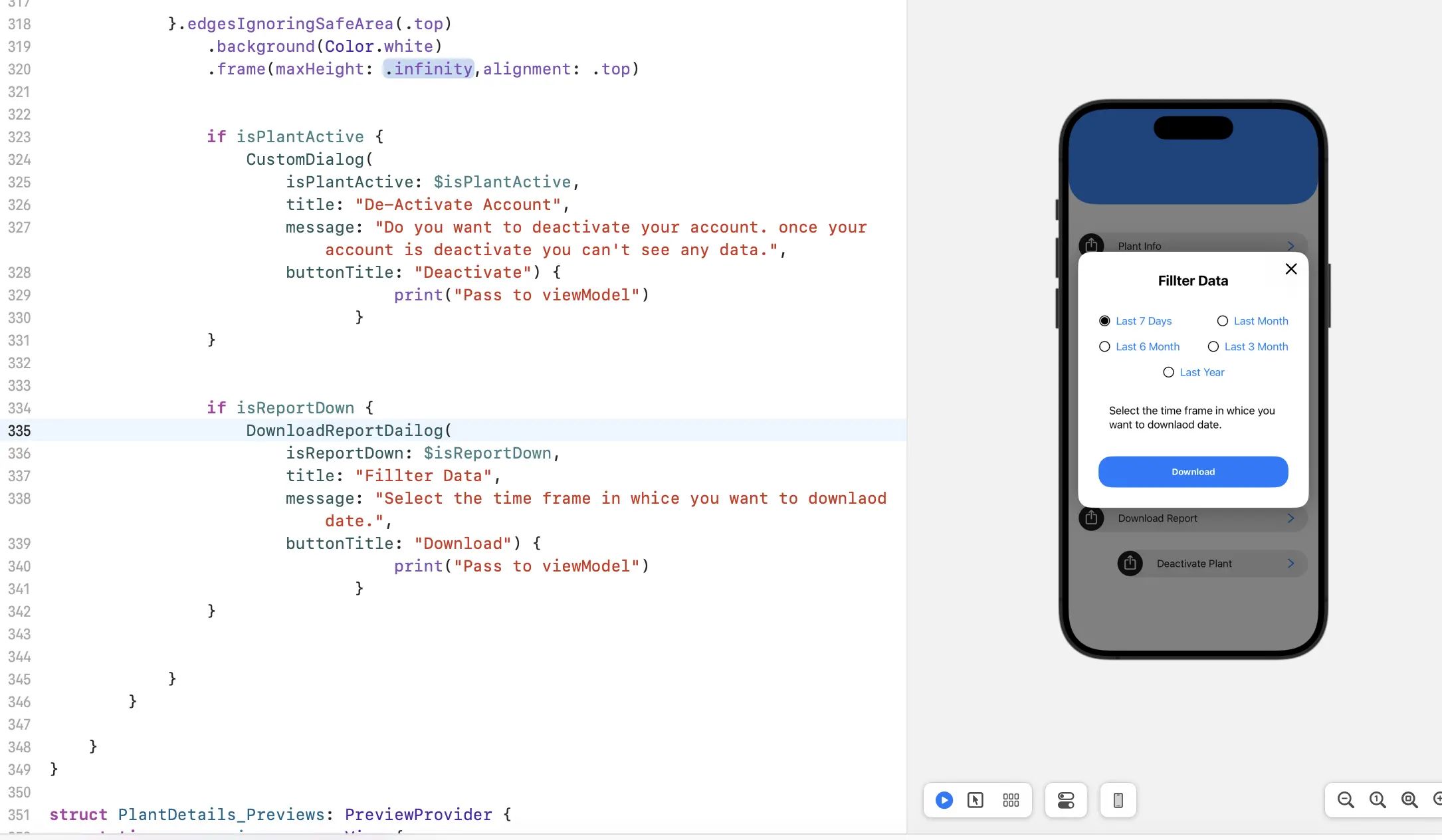
import Foundation
import SwiftUI

struct DownloadReportDailog:View {

    @Binding var isReportDown: Bool

    let title: String
    let message: String
    let buttonTitle: String
    let action: () -> ()
    @State private var offset: CGFloat = 1000

    @State var selectedOption: Int = 1

    var body: some View {

        ZStack {
            Color(.black)
                .opacity(0.5)
                .onTapGesture {
                    close()
                }

            VStack {
                Text(title)
                    .font(.title2)
                    .bold()
                    .padding()

                VStack (spacing: 20) {
                    HStack{

                        RadioButtonView(
                            index: 1,
                            selectedIndex: $selectedOption,
                            name :"Last 7 Days")
                        Spacer()

                        RadioButtonView(
                            index: 2,
                            selectedIndex: $selectedOption,
                            name :"Last Month")
                    }

                    HStack{

                        RadioButtonView(
                            index: 3,
                            selectedIndex: $selectedOption,
                            name :"Last 6 Month")
                        Spacer()

                        RadioButtonView(
                            index: 4,
                            selectedIndex: $selectedOption,
                            name :"Last 3 Month")
                    }

                    RadioButtonView(
                        index: 5,
                        selectedIndex: $selectedOption,
                        name :"Last Year")
                }
                .padding()

                Text(message)
                    .font(.body)
                    .padding()


                Button {
                    action()
                    close()
                } label: {

                    ZStack {
                        RoundedRectangle(cornerRadius: 20)
                            .foregroundColor(.blue)

                        Text(buttonTitle)
                            .font(.system(size: 14, weight: .bold))
                            .foregroundColor(.white)
                            .padding()
                    }.padding()
                }
            }
            .fixedSize(horizontal: false, vertical: true)
            .padding()
            .background(.white)
            .clipShape(RoundedRectangle(cornerRadius: 20))
            .overlay(alignment: .topTrailing) {
                Button {
                    close()
                } label: {
                    Image(systemName: "xmark")
                        .font(.title2)
                        .fontWeight(.medium)
                }
                .tint(.black)
                .padding()
            }
            .shadow(radius: 20)
            .padding(15)
            .offset(x: 0, y: offset)
            .onAppear {
                withAnimation(.spring()) {
                    offset = 0
                }
            }
        }
        .ignoresSafeArea()
    }


    func close() {
        withAnimation(.spring()) {
            offset = 1000
            isReportDown = false
        }
    }
}

struct RadioButtonView: View {
    var index: Int
    @Binding var selectedIndex: Int
    var name : String
    var body: some View {
        Button(action: {
            selectedIndex = index
        }) {
            HStack {
                Image(systemName: self.selectedIndex == self.index ? "largecircle.fill.circle" : "circle")
                    .foregroundColor(.black)
                Text("\(name)")
            }
        }
    }
}

struct Download_Previews: PreviewProvider {
    static var previews: some View {
        DownloadReportDailog(
            isReportDown: .constant(true), title: "Report", message:
"This lets you choose which photos you want to add to this project.", buttonTitle: "Send To Email", action: {})
    }
}
FAQ:
Q: Can I use this custom dialog in other parts of my app?
Ans: Yes, this custom dialog is designed to be reusable and can easily be adapted for use in other parts of your app.
Q: Can I style the dialog to match my app’s design?
Ans: Absolutely! The styling of the dialog can be customized to fit your app’s design. You can change the colors, fonts, and other visual elements to match your app’s aesthetic.
Q: How can I animate the dialog’s entrance and exit?
Ans: The dialog is animated using SwiftUI’s offset property. By manipulating the offset value, you can control the animation and create smooth transitions for the dialog’s entrance and exit.
Q: Can the dialog be dismissed by tapping on the background?
Ans: Yes, we have added a gesture recognizer to the background of the dialog. Tapping on the background will dismiss the dialog, providing an additional way for the user to close it.
Q: Can I add more buttons or additional views to the dialog?
Ans: Definitely! The custom dialog can be extended to include more buttons or additional views. By modifying the dialog’s structure and content, you can tailor it to meet your specific requirements.
Read More :