
In this post, we’ll examine the flutter bar chart. We will also implement a demo of the bar chart using the syncfusion_flutter_charts package in your flutter applications.
Flutter lets developers create top-quality UIs for apps for iOS as well as Android. A large portion of Flutter applications created by Google provides a wealth of data. To do this effectively, you need ordinary UI widgets, but lots of stunning charts.
So Let’s Start to make a vertical bar chart flutter and a horizontal bar chart flutter for both chart UI. now you can start your android studio and create a flutter project if you have an existing project open it and add the flutter package to your pubspec.yml.
Step 1: Add flutter bar chart syncfusion_flutter_charts package
in your punspec yml file add the flutter package and click on the get pub for getting all dependencies for the package.
syncfusion_flutter_charts: ^20.4.50
After that open your dart file where you want to add the flutter bar chart.
To render a bar chart, create an instance of BarSeries, and add it to the series collection property of SfCartesianChart. The following properties can be used to customize the appearance:
color– changes the color of the series.opacity– controls the transparency of the chart series.borderWidth– changes the stroke width of the series.borderColor– changes the stroke color of the series.
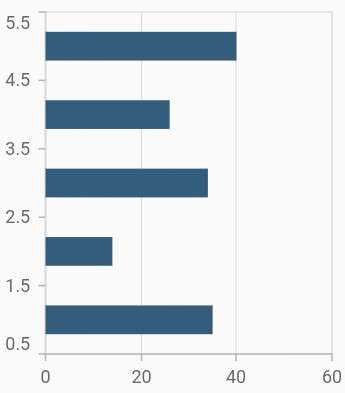
flutter bar chart – horizontal
@override
Widget build(BuildContext context) {
  final List<ChartData> chartData = [
    ChartData(1, 35),
    ChartData(2, 23),
    ChartData(3, 34),
    ChartData(4, 25),
    ChartData(5, 40)
  ];
  return Scaffold(
      body: Center(
          child: Container(
              child: SfCartesianChart(
                  series: <ChartSeries>[
                    // Renders bar chart
                    BarSeries<ChartData, double>(
                        dataSource: chartData,
                        xValueMapper: (ChartData data, _) => data.x,
                        yValueMapper: (ChartData data, _) => data.y
                    )
                  ]
              )
          )
      )
  );
}
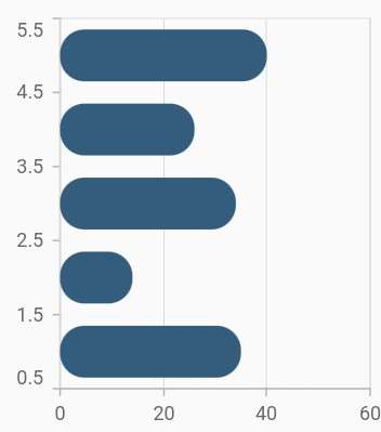
Bar width and spacing
The spacing property is used to change the spacing between two segments. The default value of spacing is 0, and the value ranges from 0 to 1. Here, 1 and 0 correspond to 100% and 0% of the available space, respectively.
The width property is used to change the width of the rectangle. The default value of the width is 0.7, and the value ranges from 0 to 1. Here, 1 and 0 correspond to 100% and 0% of the available width, respectively.
 child: SfCartesianChart(
                  series: <ChartSeries>[
                    BarSeries<ChartData, double>(
                        dataSource: chartData,
                        xValueMapper: (ChartData data, _) => data.x,
                        yValueMapper: (ChartData data, _) => data.y,
// Width of the bars
                        width: 0.6,
// Spacing between the bars
                        spacing: 0.3
                    )
                  ]
              )
flutter bar chart Rounded corners
The borderRadius property is used to add rounded corners to the rectangle.
child: SfCartesianChart(
    series: <ChartSeries>[
      BarSeries<ChartData, double>(
          dataSource: chartData,
          xValueMapper: (ChartData data, _) => data.x,
          yValueMapper: (ChartData data, _) => data.y,
          borderRadius: BorderRadius.all(Radius.circular(15))
      )
    ]
)
flutter bar chart – vertical
This article explains how to create a vertical bar chart using the Flutter SfCartesianChart widget.
Vertical bar charts are also referred to as column charts. The column chart can be customized chart using color, marker labels, tooltips, data labels, and more. feature.
The horizontal chart is referred to as a bar chart. With this bar chart and the transposed feature, it is possible to get a vertical chart. For more information on the transposed property, check out the User’s Guide.
Vertical bar chart that includes column chart type
/// Get default column chart
SfCartesianChart _buildDefaultColumnChart() {
  return SfCartesianChart(
    plotAreaBorderWidth: 0,
    primaryXAxis: CategoryAxis(
      majorGridLines: const MajorGridLines(width: 0),
    ),
    primaryYAxis: NumericAxis(
        axisLine: const AxisLine(width: 0),
        labelFormat: '{value}',
        majorTickLines: const MajorTickLines(size: 0)),
    series: _getDefaultColumnSeries(),

  );
}

/// Get default column series
List<ColumnSeries<ChartSampleData, String>> _getDefaultColumnSeries() {
  return <ColumnSeries<ChartSampleData, String>>[
    ColumnSeries<ChartSampleData, String>(
      dataSource: <ChartSampleData>[
        ChartSampleData(x: 'Jan', y: 10.541),
        ChartSampleData(x: 'Feb', y: 5.818),
        ChartSampleData(x: 'Mar', y: 7.51),
        ChartSampleData(x: 'Apr', y: 3.302),
        ChartSampleData(x: 'Jun', y: 8.017),
        ChartSampleData(x: 'Jul', y: 4.683),
      ],
      borderRadius: const BorderRadius.all(Radius.circular(10)),
      xValueMapper: (ChartSampleData sales, _) => sales.x as String,
      yValueMapper: (ChartSampleData sales, _) => sales.y,
      dataLabelSettings: const DataLabelSettings(
          isVisible: true, textStyle: TextStyle(fontSize: 10)),
    )
  ];
}

///Chart sample data
class ChartSampleData {
  /// Holds the datapoint values like x, y, etc.,
  ChartSampleData(
      {this.x,
        this.y,
        this.xValue,
        this.yValue,
        });

  /// Holds x value of the datapoint
  final dynamic x;

  /// Holds y value of the datapoint
  final num? y;

  /// Holds x value of the datapoint
  final dynamic xValue;

  /// Holds y value of the datapoint
  final num? yValue;


}
Also read