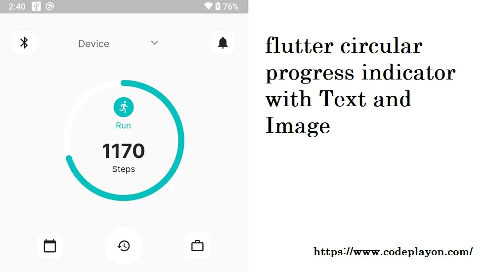
Hi everyone in this flutter tutorial we are leering how to user flutter circular progress indicator. So here i create an example to create a flutter circular progress indicator and adding image and text in the center of the circular. In Example I am using percent_indicator: ^4.2.2 library.
The Progress Indicator displays the amount of time needed to complete certain tasks such as download, installation, uploading and file transfer. This indicator shows the progress of a task and the time it takes to complete the process.
flutter circular progress indicator
percent_indicator: ^4.2.2 Features
- Circle percent indicator
- Linear percent indicator
- Animation toggle
- You can set the duration of your animation
- Progress is based on a percentage of value
- Background color and progress
- Custom size
- Linear percent indicator: Left, right or middle child
- For Circular percent indicator, top, bottom, or center child
- Progress Color with gradients
Getting started
It is important to include the router as a dependent in your flutter project.
dependencies: percent_indicator: ^4.0.1 Then, you should run Flutter Packages upgrade or Update your IntelliJ Packages. library doc
Example Project :- flutter circular progress indicator
You can find an example project in the folder. You can check it out. If not, continue reading to learn how you can get started.
Usage
Use the following command to add the import package to the dart folder where it will be used
import 'package:percent_indicator/percent_indicator.dart'; Circular percent indicator Basic Widget
new CircularPercentIndicator(
  radius: 60.0,
  lineWidth: 5.0,
  percent: 1.0,
  center: new Text("100%"),
  progressColor: Colors.green,
)
Flutter circular progress indicator with Text and Image full source code
class _HomeScreenViewState extends State<HomeScreenView> {
  bool isNoChargerAdded = false;
  bool isShowPass = false;
  int valueHolder = 20;
  @override
  Widget build(BuildContext context) {
      final Size size = MediaQuery.of(context).size;
      final ThemeData themeData = Theme.of(context);
      return Scaffold(
        body: Container(
            width: size.width,
            height: size.height,
              child: Column(
                children: [
                  Container(
                      padding: EdgeInsets.fromLTRB(20, 50, 20, 0),
                      child: Column(
                        children: [
                          Row(
                            mainAxisAlignment: MainAxisAlignment.spaceBetween,
                            children: [
                              BorderBox(
                                child:Icon(Icons.bluetooth),
                                width: 44,
                                height: 44,
                                isAction: 0,
                              ),
                              SizedBox(
                                height: 40,
                                width: 150,
                                child: TextField(
                                  onTap: () {
                                    FocusScope.of(context).requestFocus(new FocusNode());

                                  },
                                  onChanged: (text) {},
                                  style: themeData.textTheme.bodyText2,
                                  autocorrect: false,
                                  enableSuggestions: false,
                                  obscureText: !isShowPass,
                                  decoration: InputDecoration(
                                    // hintStyle: TextStyle(color: COLOR_THEME),
                                    hintText: "Device",
                                    border: InputBorder.none,
                                    suffixIcon: IconButton(
                                      icon: Icon(
                                        isShowPass
                                            ? Icons.keyboard_arrow_up
                                            : Icons.keyboard_arrow_down,
                                        color: Colors.grey,
                                      ),
                                      onPressed: () {
                                        setState(() {

                                          isShowPass = !isShowPass;
                                        });
                                      },
                                    ),
                                  ),
                                ),
                              ),
                              BorderBox(
                                child:Icon(Icons.notifications),
                                width: 44,
                                height: 44,
                                isAction: 0,
                              ),
                            ],

                          ),
                        ],
                      )
                  ),
                  SizedBox(
                    height: 25,
                  ),
                  Padding(
                    padding: EdgeInsets.all(15.0),
                    child: CircularPercentIndicator(
                      radius: 100.0,
                      lineWidth: 10.0,
                      animation: true,
                      percent: 0.7,
                      center: Container(
                        height: 150.0,
                        width: 90.0,
                        child: new Column(
                          crossAxisAlignment: CrossAxisAlignment.center,
                          children: <Widget>[
                            Icon(Icons.run_circle_rounded,
                              size: 40.0,
                              color: COLOR_THEME,
                            ),
                            SizedBox(
                              height: 1,
                            ),
                            Text("Run",style: TextStyle(
                                color: COLOR_THEME, fontWeight: FontWeight.w400, fontSize: fontsize14)),
                            SizedBox(
                              height: 15,
                            ),
                            Text("1170",style: TextStyle(
                                color: COLOR_BLACK, fontWeight: FontWeight.w700, fontSize: fontsize32)),
                            SizedBox(
                              height: 1,
                            ),
                            Text("Steps",style: themeData.textTheme.subtitle1),
                          ],
                        ),
                      ),
                      backgroundColor: Colors.white,
                      progressColor: COLOR_THEME,
                      circularStrokeCap: CircularStrokeCap.round,
                    ),
                  ),

                  SizedBox(
                    height: 25,
                  ),
                  Container(
                      padding: EdgeInsets.fromLTRB(60, 0, 60, 0),
                      child: Column(
                        children: [
                          Row(
                            mainAxisAlignment: MainAxisAlignment.spaceBetween,
                            children: [
                              BorderBox(
                                child:Icon(Icons.calendar_today),
                                width: 48,
                                height: 48,
                                isAction: 0,
                              ),
                              BorderBox(
                                child:Icon(Icons.history),
                                width: 68,
                                radius: 50,
                                height: 68,
                                isAction: 0,
                              ),

                              BorderBox(
                                child:Icon(Icons.work_outline_outlined),
                                width: 48,
                                height: 48,
                                isAction: 0,
                              ),
                            ],

                          ),
                        ],
                      )
                  ),
                  Container(
                      margin: EdgeInsets.fromLTRB(20, 10,20, 0),
                      child: Slider(
                          value: valueHolder.toDouble(),
                          min: 1,
                          max: 100,
                          divisions: 100,
                          activeColor: COLOR_THEME,
                          inactiveColor: Colors.grey,
                          label: '${valueHolder.round()}',
                          onChanged: (double newValue) {
                            setState(() {
                              valueHolder = newValue.round();
                            });
                          },
                          semanticFormatterCallback: (double newValue) {
                            return '${newValue.round()}';
                          }
                      )
                  ),
                  new CircularPercentIndicator(
                    radius: 60.0,
                    lineWidth: 5.0,
                    percent: 1.0,
                    center: new Text("100%"),
                    progressColor: Colors.green,
                  )

                ],
              ),


        ),
      );
  }
}
Add above code on you main calls and run app check the output for these example.
Read More:-
- Codeplayon Jetpack Compose Tutorial
- Codeplayon Android Tutorial
- Codeplayon Flutter Tutorial
- Codeplayon on Github