Hi Developer in this jetpack compose article I share how to create a bottom sheet in Android jetpack compose. In the Android jetpack compose there are Two types of the bottom sheet. It’s a BottomSheetScaffold and the ModalBottomSheetLayout bottom sheet.
Jetpack compose Bottom Sheet type.
- BottomSheetScaffold
- ModalBottomSheetLayout
BottomSheetScaffold:- doesn’t block the screen’s main UI when it appears, and Also you can view or interact with both (main screen UI and bottom sheet) concurrently. Also, you can set a bottom sheet height to show part of it all the time.
ModalBottomSheetLayout:- This is like a popup view. It shows up when you press a button and they block the interaction with the main screen.
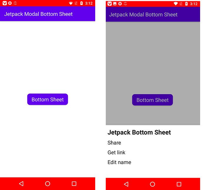
So in this article, we make a Modal Bottom Sheet and Its UI using jetpack compose. Here we make a screen with the button and on button click to show the UI and its item menu. So let’s start to make it. Start your android studio and create the project by choosing a jetpack to compose the activity.
Gradle build Source.
dependencies {

    implementation 'androidx.core:core-ktx:1.7.0'
    implementation 'androidx.appcompat:appcompat:1.4.1'
    implementation 'com.google.android.material:material:1.5.0'
    implementation "androidx.compose.ui:ui:$compose_version"
    implementation "androidx.compose.material:material:$compose_version"
    implementation "androidx.compose.ui:ui-tooling-preview:$compose_version"
    implementation 'androidx.lifecycle:lifecycle-runtime-ktx:2.4.0'
    implementation 'androidx.activity:activity-compose:1.4.0'
    testImplementation 'junit:junit:4.+'
    androidTestImplementation 'androidx.test.ext:junit:1.1.3'
    androidTestImplementation 'androidx.test.espresso:espresso-core:3.4.0'
    androidTestImplementation "androidx.compose.ui:ui-test-junit4:$compose_version"
    debugImplementation "androidx.compose.ui:ui-tooling:$compose_version"

    // Insets
    implementation "com.google.accompanist:accompanist-insets:0.17.0"
    // System UI Controller
    implementation "com.google.accompanist:accompanist-systemuicontroller:0.17.0"
}
Main Activity file Source code
you can find below the full source code of the full UI using jetpack compose.
@ExperimentalMaterialApi
class MainActivity : ComponentActivity() {
    override fun onCreate(savedInstanceState: Bundle?) {
        super.onCreate(savedInstanceState)
        setContent {
            ModalBottomSheetTheme {
                Surface(color = MaterialTheme.colors.background) {
                    //Status and Navigation Bar color
                    val systemUiController = rememberSystemUiController()
                    systemUiController.setStatusBarColor(Color.Red)
                    systemUiController.setNavigationBarColor(Color.Red)

                    ModalBottomSheet()
                }
            }
        }
    }
}

@ExperimentalMaterialApi
@Composable
fun ModalBottomSheet() {
    val coroutineScope = rememberCoroutineScope()
    val sheetState = rememberModalBottomSheetState(initialValue = ModalBottomSheetValue.Hidden)

    ModalBottomSheetLayout(
        sheetContent = {
            Box(
                modifier = Modifier
                    .navigationBarsWithImePadding()
                    .height(200.dp)
                    .fillMaxWidth()
                    .background(Color.White)
            ) {
                Column(
                    modifier = Modifier
                        .fillMaxSize()
                        .padding(10.dp)
                ) {
                    Text(
                        text = "Jetpack Bottom Sheet",
                        textAlign = TextAlign.Left,
                        style = MaterialTheme.typography.h5,
                        fontWeight = FontWeight.Bold,
                        modifier = Modifier.fillMaxWidth()
                    )
                    Text(
                        text = "Share",
                        style = MaterialTheme.typography.h6,
                        modifier = Modifier.padding(top = 10.dp)
                    )
                    Text(
                        text = "Get link",
                        style = MaterialTheme.typography.h6,
                        modifier = Modifier.padding(top = 10.dp)
                    )
                    Text(
                        text = "Edit name",
                        style = MaterialTheme.typography.h6,
                        modifier = Modifier.padding(top = 10.dp)
                    )
                }
            }
        },
        sheetState = sheetState,
        sheetBackgroundColor = Color.White
    ) {
        Scaffold(
            topBar = {
                TopAppBar(
                    title = {
                        Text(
                            text = "Jetpack Modal Bottom Sheet",
                            modifier = Modifier.fillMaxWidth(),
                            textAlign = TextAlign.Left
                        )
                    }
                )
            }
        ) {
            MainContent(
                onClick = {
                    coroutineScope.launch {
                        sheetState.show()
                    }
                },
                modifier = Modifier.padding(it)
            )
        }
    }
}

@Composable
fun MainContent(
    onClick: () -> Unit,
    modifier: Modifier = Modifier
) {
    Box(
        contentAlignment = Alignment.Center,
        modifier = modifier.fillMaxSize()
    ) {
        Button(
            onClick = onClick,
            shape = RoundedCornerShape(10.dp)
        ) {
            Text(
                text = "Bottom Sheet",
                textAlign = TextAlign.Center,
                style = MaterialTheme.typography.h6.copy(color = Color.White)
            )
        }
    }
}
Now you can run your project and see the UI of your example.
Read More Tutorial