Custom AlertDialog with Jetpack Compose Android. Jetpack Compose is a great new declarative UI tool for Android that allows UI creation using Kotlin as a replacement for the cumbersome XML layouts.
This article will provide a straightforward demonstration of Jetpack Compose inside the context of a project. It also explains how to build an alert-based dialog that could help in requesting the user to verify or deny essential actions.
AlertDialog with Jetpack Compose
You can follow this guide in case you are running already an XML layout-based Android app and wish to integrate Compose UI elements in it, or want to start your own app and wish to create the UI using Compose from the beginning.
To experience the best possible experience in developing in Jetpack Compose to get the best experience, you must install Android Studio Arctic Fox, which allows you to access your built-in view of the UI that you design. Additionally, it comes with the ability to create an entirely fresh Compose project.
Creating a new Jetpack Compose app
To make a brand new app, you need to open Android Studio, select the File and then Create New A New Project In the wizard choose the empty Compose Activity. After that select Finish and a brand fresh Jetpack Compose project will be created.
If you’re a novice in Jetpack Compose, I recommend going through this comprehensive introduction article. It offers a thorough overview of the components available and explains the fundamentals behind Jetpack Compose. But, I’ll provide a detailed explanation of everything we will encounter as we progress through this post.
This article also assumes that you’re familiar with ViewModel (from Android architecture components) and the UI state of ViewModel. ViewModel through Stateflow using Kotlin coroutines.
Creating AlertDialog with Jetpack Compose
Jetpack Compose provides a domain-specific language (DSL) to create UIs using Kotlin. Each UI element is created by a function that is annotated with @Composable which could or might not accept arguments, but always returns the Unit.
This is because this function is only changing a UI composition as a secondary result and doesn’t return any results. As a rule these functions are written with capital letters, making it easy to mistake them for classes.
Let’s take a look at the document for a material AlertDialog adaptable (I have left out the parameters because they’re not necessary at this time):
Now Follow the Below steps for creating a custom alert Dialog using jetpack compose
Add the Below dependency in your Gradle build
dependencies {

    implementation 'androidx.core:core-ktx:1.7.0'
    implementation "androidx.compose.ui:ui:$compose_version"
    implementation "androidx.compose.material:material:$compose_version"
    implementation "androidx.compose.ui:ui-tooling-preview:$compose_version"
    implementation 'androidx.lifecycle:lifecycle-runtime-ktx:2.3.1'
    implementation 'androidx.activity:activity-compose:1.3.1'
    testImplementation 'junit:junit:4.13.2'
    androidTestImplementation 'androidx.test.ext:junit:1.1.3'
    androidTestImplementation 'androidx.test.espresso:espresso-core:3.4.0'
    androidTestImplementation "androidx.compose.ui:ui-test-junit4:$compose_version"
    debugImplementation "androidx.compose.ui:ui-tooling:$compose_version"
}
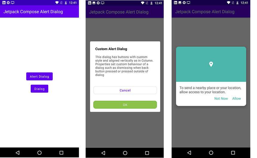
Custom Dialog Jetpack Compose.
//Create custom dialog
@Composable
fun DialogExample(
    onDismiss: () -> Unit,
    onNegativeClick: () -> Unit,
    onPositiveClick: () -> Unit
) {
    Dialog(onDismissRequest = onDismiss) {
        val color = Color(0xff4DB6AC)
        Card(elevation = 8.dp, shape = RoundedCornerShape(12.dp)) {
            Column {
                Box(
                    modifier = Modifier
                        .fillMaxWidth()
                        .height(160.dp)
                        .background(color)
                ) {
                    Icon(
                        tint = Color.White,
                        painter = painterResource(id = R.drawable.ic_baseline_location_on_24),
                        contentDescription = null,
                        modifier = Modifier
                            .graphicsLayer(scaleX = 1.2f, scaleY = 1.2f)
                            .align(
                                Alignment.Center
                            )
                    )
                }

                Column(modifier = Modifier.padding(16.dp)) {
                    CompositionLocalProvider(LocalContentAlpha provides ContentAlpha.medium) {
                        Text("To send a nearby place or your location, allow access to your location.")
                    }
                    Row(
                        horizontalArrangement = Arrangement.End,
                        modifier = Modifier.fillMaxWidth()
                    ) {

                        Text(
                            text = "Not Now", color = color,
                            modifier = Modifier
                                .clickable(
                                    interactionSource = MutableInteractionSource(),
                                    indication = rememberRipple(color = Color.DarkGray),
                                    onClick = onNegativeClick
                                )
                                .padding(8.dp)
                        )

                        Spacer(modifier = Modifier.width(4.dp))
                        Text(
                            text = "Allow", color = color,
                            modifier = Modifier
                                .clickable(
                                    interactionSource = MutableInteractionSource(),
                                    indication = rememberRipple(color = Color.DarkGray),
                                    onClick = onPositiveClick
                                )
                                .padding(8.dp)
                        )
                    }
                }
            }
        }
    }
Alert Dialog Jetpack Compose.
//Custom AlertDialog
@Composable
fun AlertDialogExample(
    onDismiss: () -> Unit
) {
    AlertDialog(
        onDismissRequest = onDismiss,
        properties = DialogProperties(
            dismissOnBackPress = true,
            dismissOnClickOutside = false,
            securePolicy = SecureFlagPolicy.Inherit
        ),
        title = {
            Text("Custom Alert Dialog", fontWeight = FontWeight.Bold)
        },
        text = {
            Text(text = "This dialog has buttons with custom style and aligned vertically as in Column. Properties set custom behaviour of a dialog such as dismissing when back button pressed or pressed outside of dialog")
        },
        buttons = {
            OutlinedButton(
                shape = RoundedCornerShape(percent = 30),
                onClick = onDismiss,
                modifier = Modifier
                    .padding(15.dp)
                    .fillMaxWidth()
            ) {
                Text(text = "Cancel")
            }
            Spacer(modifier = Modifier.width(10.dp))
            OutlinedButton(
                shape = RoundedCornerShape(percent = 30),
                onClick = onDismiss,
                colors = ButtonDefaults.outlinedButtonColors(
                    backgroundColor = Color(0xff8BC34A),
                    contentColor = Color.White
                ),
                modifier = Modifier
                    .padding(15.dp)
                    .fillMaxWidth()
            ) {
                Text(text = "OK")
            }
        }
    )
}
Full Souce Code of MainActivity
import android.os.Bundle
import android.widget.Toast
import androidx.activity.ComponentActivity
import androidx.activity.compose.setContent
import androidx.compose.foundation.background
import androidx.compose.foundation.clickable
import androidx.compose.foundation.interaction.MutableInteractionSource
import androidx.compose.foundation.layout.*
import androidx.compose.foundation.shape.RoundedCornerShape
import androidx.compose.material.*
import androidx.compose.material.ripple.rememberRipple
import androidx.compose.runtime.*
import androidx.compose.ui.Alignment
import androidx.compose.ui.Modifier
import androidx.compose.ui.graphics.Color
import androidx.compose.ui.graphics.graphicsLayer
import androidx.compose.ui.platform.LocalContext
import androidx.compose.ui.res.painterResource
import androidx.compose.ui.text.font.FontWeight
import androidx.compose.ui.text.style.TextAlign
import androidx.compose.ui.unit.dp
import androidx.compose.ui.window.Dialog
import androidx.compose.ui.window.DialogProperties
import androidx.compose.ui.window.SecureFlagPolicy
import com.jetpack.alertdialoganddialog.ui.theme.AlertDialogAndDialogTheme

class MainActivity : ComponentActivity() {
    override fun onCreate(savedInstanceState: Bundle?) {
        super.onCreate(savedInstanceState)
        setContent {
            AlertDialogAndDialogTheme {
                Surface(
                    modifier = Modifier.fillMaxSize(),
                    color = MaterialTheme.colors.background
                ) {
                    Scaffold(
                        topBar = {
                            TopAppBar(
                                title = {
                                    Text(
                                        text = "Jetpack Compose Alert Dialog",
                                        modifier = Modifier.fillMaxWidth(),
                                        textAlign = TextAlign.Left
                                    )
                                }
                            )
                        }
                    ) {
                        AlertDialogAndDialog()
                    }
                }
            }
        }
    }
}

@Composable
fun AlertDialogAndDialog() {
    var showAlertDialog by remember { mutableStateOf(false) }
    var showDialog by remember { mutableStateOf(false) }
    val context = LocalContext.current
    Column(
        modifier = Modifier.fillMaxSize(),
        horizontalAlignment = Alignment.CenterHorizontally,
        verticalArrangement = Arrangement.Center
    ) {
        Button(
            onClick = {
                showAlertDialog = !showAlertDialog
            }
        ) {
            Text(
                text = "Alert Dialog"
            )
        }
        if (showAlertDialog) {
            AlertDialogExample {
                showAlertDialog = !showAlertDialog
            }
        }
        Spacer(modifier = Modifier.height(20.dp))
        Button(
            onClick = {
                showDialog = !showDialog
            }
        ) {
            Text(
                text = "Dialog"
            )
        }
        if (showDialog) {
            DialogExample(
                onDismiss = {
                    showDialog = !showDialog
                    Toast.makeText(context, "Dialog dismissed!", Toast.LENGTH_SHORT)
                        .show()
                },
                onNegativeClick = {
                    showDialog = !showDialog
                    Toast.makeText(context, "Negative Button Clicked!", Toast.LENGTH_SHORT)
                        .show()

                },
                onPositiveClick = {
                    showDialog = !showDialog
                    Toast.makeText(context, "Positive Button Clicked!", Toast.LENGTH_SHORT)
                        .show()
                }
            )
        }
    }
}

//Custom AlertDialog
@Composable
fun AlertDialogExample(
    onDismiss: () -> Unit
) {
    AlertDialog(
        onDismissRequest = onDismiss,
        properties = DialogProperties(
            dismissOnBackPress = true,
            dismissOnClickOutside = false,
            securePolicy = SecureFlagPolicy.Inherit
        ),
        title = {
            Text("Custom Alert Dialog", fontWeight = FontWeight.Bold)
        },
        text = {
            Text(text = "This dialog has buttons with custom style and aligned vertically as in Column. Properties set custom behaviour of a dialog such as dismissing when back button pressed or pressed outside of dialog")
        },
        buttons = {
            OutlinedButton(
                shape = RoundedCornerShape(percent = 30),
                onClick = onDismiss,
                modifier = Modifier
                    .padding(15.dp)
                    .fillMaxWidth()
            ) {
                Text(text = "Cancel")
            }
            Spacer(modifier = Modifier.width(10.dp))
            OutlinedButton(
                shape = RoundedCornerShape(percent = 30),
                onClick = onDismiss,
                colors = ButtonDefaults.outlinedButtonColors(
                    backgroundColor = Color(0xff8BC34A),
                    contentColor = Color.White
                ),
                modifier = Modifier
                    .padding(15.dp)
                    .fillMaxWidth()
            ) {
                Text(text = "OK")
            }
        }
    )
}

//Create custom dialog
@Composable
fun DialogExample(
    onDismiss: () -> Unit,
    onNegativeClick: () -> Unit,
    onPositiveClick: () -> Unit
) {
    Dialog(onDismissRequest = onDismiss) {
        val color = Color(0xff4DB6AC)
        Card(elevation = 8.dp, shape = RoundedCornerShape(12.dp)) {
            Column {
                Box(
                    modifier = Modifier
                        .fillMaxWidth()
                        .height(160.dp)
                        .background(color)
                ) {
                    Icon(
                        tint = Color.White,
                        painter = painterResource(id = R.drawable.ic_baseline_location_on_24),
                        contentDescription = null,
                        modifier = Modifier
                            .graphicsLayer(scaleX = 1.2f, scaleY = 1.2f)
                            .align(
                                Alignment.Center
                            )
                    )
                }

                Column(modifier = Modifier.padding(16.dp)) {
                    CompositionLocalProvider(LocalContentAlpha provides ContentAlpha.medium) {
                        Text("To send a nearby place or your location, allow access to your location.")
                    }
                    Row(
                        horizontalArrangement = Arrangement.End,
                        modifier = Modifier.fillMaxWidth()
                    ) {

                        Text(
                            text = "Not Now", color = color,
                            modifier = Modifier
                                .clickable(
                                    interactionSource = MutableInteractionSource(),
                                    indication = rememberRipple(color = Color.DarkGray),
                                    onClick = onNegativeClick
                                )
                                .padding(8.dp)
                        )

                        Spacer(modifier = Modifier.width(4.dp))
                        Text(
                            text = "Allow", color = color,
                            modifier = Modifier
                                .clickable(
                                    interactionSource = MutableInteractionSource(),
                                    indication = rememberRipple(color = Color.DarkGray),
                                    onClick = onPositiveClick
                                )
                                .padding(8.dp)
                        )
                    }
                }
            }
        }
    }
}
Read More Tutorial
- How to Convert Speech To Text in Jetpack Compose
- bottom sheet android jetpack compose
- Jetpack Compose Ticket ZigZag View
- Bluetooth 5 and its uses in IoT explained
- How to Generate PDF Files using Jetpack Compose
- Recognize Text using ML Kit Android Jetpack Compose
- Bluetooth Thermal Receipt Printer Android Integration Printer
- Jetpack Compose Tutorial
- Android Tutorial
- Flutter Tutorial